
One of the things that shocks you when you go from Linux or Mac to Windows is the irregular representation of typographic fonts offered by the Microsoft operating system. Irregular, literally, since neither the quality is the same in comparison, nor is it within the Windows desktop and applications itself. It is strange that something like this happens in what is the most used system in the world, also developed by one of the largest companies in the world.
Well, at least as far as the Chrome browser is concerned, and whoever says Chrome, says Chromium and all its derivatives, from Microsoft Edge itself – this was the first to receive it – to Brave, Opera, Vivaldi and others, this is going to improve soon, thanks to the work of those from Redmond. Be starting with the next base browser update, Chromium 124, when Windows ClearType integration is included to improve font readability. This setting helps resolve “gray” or “blurry” text issues for some users, especially at high contrast or gamma settings for accessibility reasons.
ClearType Microsoft’s is a subpixel rendering technology that supposedly makes on-screen text resemble printed text. It was developed by Microsoft’s e-book team in the late 1990s, although it was quickly integrated into Windows. It is a classic in desktop configuration, even though many modern applications do not use it. Among the exceptions are various elements within the operating system, including the file manager itself, legacy applications and… yes, web browsers.
In the case of Chromium, the browser uses the Skia engine to render graphics, which will not change. Thus, the ClearType support that is integrated into it will not be complete; but access to Skia, the component responsible for applying the configuration settings, will be facilitated. ClearType Text Tuner of the users. This change is expected to improve the readability of fonts in Chrome, especially in environments with low-resolution LCD screens, high-contrast fonts, etc., although ultimately the improvement should be generalized.
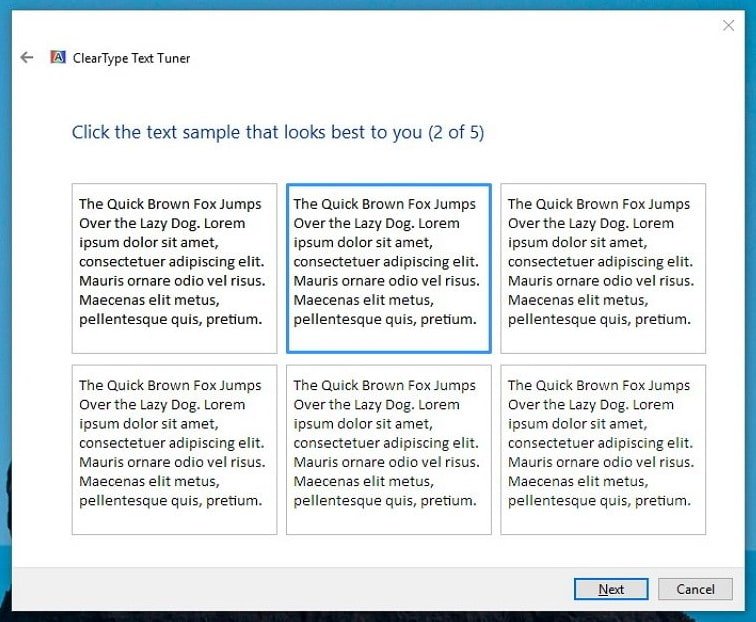
Who doesn’t remember the ClearType settings?
Microsoft Edge implemented ClearType integration on its own years ago, even though it has never been activated by default. Now, however, it will do so directly in the Chromium code, so that the improvement – or at least, the possibility of using it – is extensible to the rest of the web browsers based on it, including Edge itself, it is worth repeating, because of The way this change is being implemented will make it easier to maintain in the future. In any case, the matter is much more complex.
On the one hand, it is important to highlight that ClearType is designed specifically for LCD screens and only works correctly when using a screen with its native resolution. On OLED monitors or a television ClearType may not have any benefit. On the other hand, the disparity in technologies and methods used by applications means that with or without ClearType, functions in Windows appear, as we pointed out at the beginning, to have an irregular representation. And the improvement in the last decade has been remarkable.
Little by little, in fact, Windows font rendering is approaching that of Mac or Linux, with its still inconsistencies (no system is free from these inconsistencies, it’s just that in Windows they are much more noticeable). But if what you’re interested in is how things look in Windows, try comparing Firefox with Chrome, in the texts of the pages, the internal pages of the browsers, the menus, etc. The differences continue to be appreciated, although they are becoming less and less. AND Starting with Chrome 124, fewer should be.