Two courses can teach the same thing and one outsells the other five to one — on looks alone. The visuals that move conversion, how to make them cohesive, the text catch, and how to do it all for cents instead of a designer's fee.
This post contains affiliate links. If you buy through them, Aliteq may earn a commission — at no extra cost to you. Prices verified at publish time.
Share
Two courses can teach the exact same thing and one outsells the other five to one, purely on how they look. That's not vanity — it's trust. When someone lands on your sales page, they decide in a couple of seconds whether this looks like a real product from someone who knows their stuff, or a Word doc with a price tag. The course cover, the module thumbnails, the hero image, the little mockups — those visuals are doing the persuading before a single word gets read. And they used to require a designer. Now they cost cents.
I generate this stuff, so here's the practical version: exactly which visuals move the needle on a course page, how to make them look cohesive instead of random, the one catch that trips everyone up (text), and how to keep it all on-brand. This is the fastest-ROI visual work in the whole course build — it lifts conversion the day you swap it in.
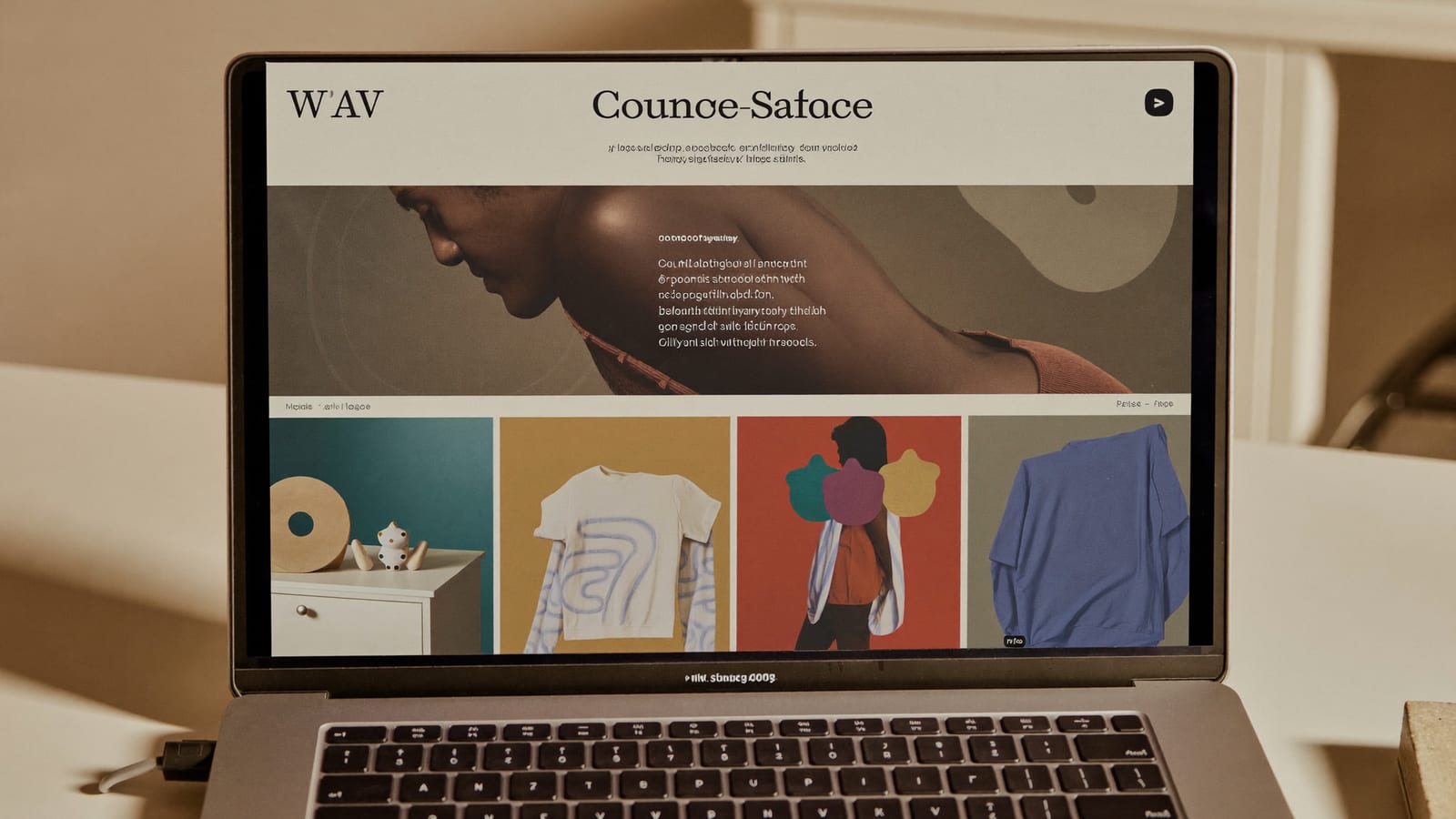
A sales page that looks like a real product — the trust cue that does the selling. Generated with Higgsfield. · Generated with Higgsfield
The visuals that actually move conversion
The course cover — the single most-seen image (thumbnail everywhere your course appears). It should read at a glance and match your topic's vibe. Generate a strong background/illustration, add the title yourself.
The sales-page hero — the big image at the top of your landing page. This sets the entire first impression; make it feel premium and on-topic.
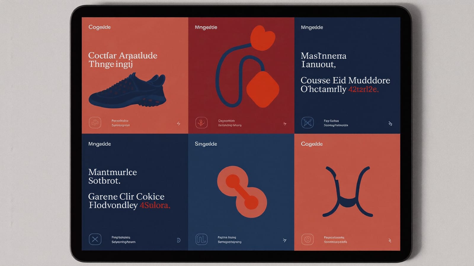
Module / lesson thumbnails — 6–12 small consistent tiles that make the curriculum look substantial and organized. A cohesive set here is a huge trust signal.
Device mockups — your course shown on a laptop and phone. 'It looks like a real platform' reassures buyers it's a finished thing, not a promise.
Social & ad cards — the same visual system resized for Instagram, a course trailer thumbnail, an ad. Reuse the style so everything looks like one brand.
A cohesive set of module thumbnails makes a curriculum look substantial and organized. Generated with Higgsfield. · Generated with Higgsfield
How to make them look cohesive (not random)
The mistake I see most is generating each image with a totally different prompt, so the cover is photoreal, the thumbnails are cartoon, and the hero is a 3D render — and the whole page looks stitched together from a stock-image bin. The fix is a style lock: decide the palette, the mood, and the visual style once, and put those same descriptors in every prompt. A consistent set is what turns 'AI images' into 'a brand'.
A reusable style block to paste into every course-visual prompt
Style lock
Consistent brand style: [your palette, e.g. deep navy + warm coral accents], clean modern editorial illustration, soft depth, minimal, plenty of negative space for a title, 16:9, no text, no logos.
Course cover
[Style lock] — a striking symbolic hero image for a course about [topic], centered composition, empty space at the top for a title.
Module thumbnail set
[Style lock] — a small square icon-style illustration representing [lesson concept], same lighting and palette as the set, simple and legible at small size.
Device mockup scene
[Style lock] — a clean laptop and phone on a tidy desk in soft daylight, screens left blank for a mockup, premium and minimal.
What this replaces
Cost of a full course visual set (cover, hero, 10 thumbnails, mockups, social)
Freelance designer~$800–1,500
+ a week of back-and-forth
Premium template pack + tweaking~$100–200
still generic, still your time
AI-generated + your titles~cents each
an afternoon, fully custom
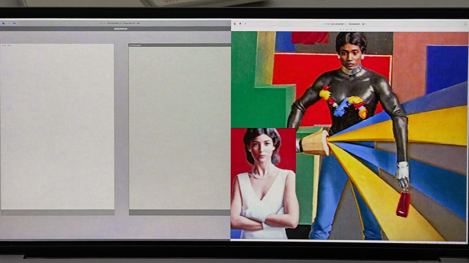
Same course, same price — the visual redesign is what changes whether people trust it enough to buy. Generated with Higgsfield. · Generated with Higgsfield
Higgsfield · Course visuals
Sponsored
This is exactly what Higgsfield's image models are for — generate your course cover, sales-page hero, module thumbnails and social cards in one consistent style, for cents each. Add your titles in any editor. Free tier to see the look before you pay.
They affect the first-impression trust decision, which happens before anyone reads your copy — so yes, they're a real conversion lever, especially cold traffic from ads or social. They won't fix a bad offer, but a good offer with amateur visuals leaves money on the table.
How do I stop the images looking obviously AI?
Cohesion and restraint. Lock one style and palette across the whole set, avoid the over-saturated 'default AI' look, keep compositions clean with space for your text, and always add real typography yourself. A consistent, understated set reads as designed, not generated.
Can I just use a template site like Canva instead?
Use both — that's the best workflow. Generate custom, on-brand imagery with AI (templates make everyone's page look the same), then assemble and add text in Canva or Figma where typography and layout are easy. AI for the unique visuals, a template tool for the layout and words.
What size and format should I generate?
Generate at 16:9 and crop as needed — it covers hero images and most thumbnails, and you can reframe to square or vertical for social. Keep source images high-resolution so they stay crisp when scaled down; a blurry hero undoes all the trust you were building.